Divisional brand: Authentication
The Authentication brand is used to promote brand specific activities and products. It has a specific set of colours, patterns and gradients to distinguish itself from the Global and Currency brands.
Whatever is being created, video, brochures, flyers, a PowerPoint deck, we need to make sure the correct colours, patterns, gradients, typefaces and graphics are used throughout.
For external users and suppliers, please get in touch with your contact at De La Rue, or reach out to marketing@delarue.com to access our brand assets.
For all De La Rue Office365 users there is a SharePoint site which includes a document template library with pre-built PowerPoint and Word templates to get you started, an image library of approved artwork, brand assets and how-to guides to help you begin integrating the brand guidelines into your work.
Full details of the brand guidelines and links to relevant assets can be found in the menu bar. For internal users, please visit the SharePoint site, link is in the Resources tab.
Powerpoint
This section is for internal users as Powerpoint is widely used throughout De La Rue. When creating slide decks to present to an external audience, you will need to download the new template. Follow the link to download the new template.
Covers
|
|
|
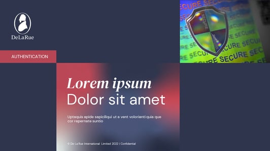
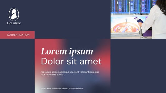
Plain background, product in society image, and gradient
|
Plain background, product image, and gradient |
|
|
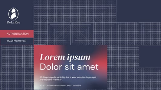
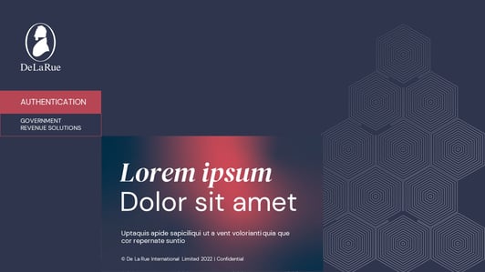
| Government patterned background, gradient and no image |
Brand Protection patterned background, gradient and no image |
- Use the White logo on a De La Rue Blue background
- Choose either an Authentication pattern and gradient, or a plain background, an appropriate image and gradient.
- A large gradient filled title block holds the headline, written in DM Sans or Arial, with keywords highlighted in DM Serif Display Italic or Georgia Italic. Select an Authentication division gradient to place within the title block
- Use the tier 1 or 2 division labelling system to indicate that this is a Authentication document. Follow the link for details. This should be placed below the logo and connect with the corner of the title block
- If using a plain background, add one ‘product in society’ image that is relevant to the document title
- If using a patterned background, do not use an image
- Use the underlying grid to position images and blocks as part of our graphic system
- For more details on the Authentication division specific colours, patterns, imagery and gradients, look under the "Elements" section.
Updating old slide decks
Due to the size of De La Rue and number of slide decks, for the majority of us, it will our personal responsibility to update our slide decks into the current format. Please prioritise decks that are externally facing, or are viewed by a large number of internal stakeholders first.
Instructions on how to transfer content between decks can be found here. It will likely be necessary to manually edit the destination slides as the old content will use different formatting which will not map across to the new format.
If you need more support on how to transfer your slide decks, please raise a ticket with De La Rue IT, using the Digital Workplace app.
Brochure covers and spread
The following applies to external agencies retained to create De La Rue branded collateral. Internal requirement requests for content should initially be directed to marketing@delarue.com.
When creating brochure covers and spreads for the Currency division, please consider the following:
Covers
- Use the White logo on a De La Rue Blue background
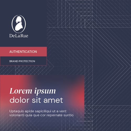
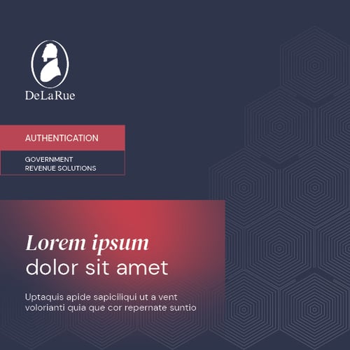
- Choose either a Authentication pattern and gradient, or a plain background, an appropriate image and gradient.
- A large gradient filled title block holds the headline, written in DM Sans, with keywords highlighted in DM Serif Display Italic. Select an Authentication division gradient to place within the title block
- Use the tier 1 or 2 division labelling system to indicate that this is a Authentication document. Follow the link for details. This should be placed below the logo and connect with other elements where possible
- If using a plain background, add one ‘product detail’ image that is relevant to the document title
- If using a patterned background, do not use an image
- Use the underlying grid to position images and blocks as part of our graphic system
- More details on the Authentication division specific colours, patterns, imagery and gradients are located elsewhere in the brand portal
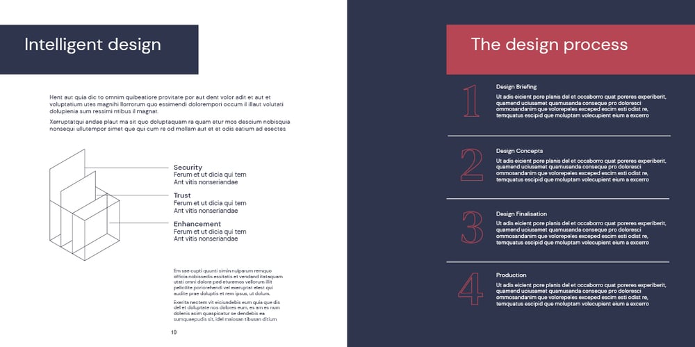
Spreads
- Page titles can appear in coloured blocks for stand-out
- The Authentication division gradients can be used as backgrounds for text or images boxes, or for infographics
- Consider maximising the use of the grid for to add variety to the layout
Pull up banners
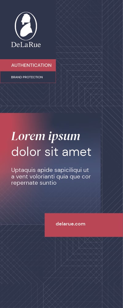
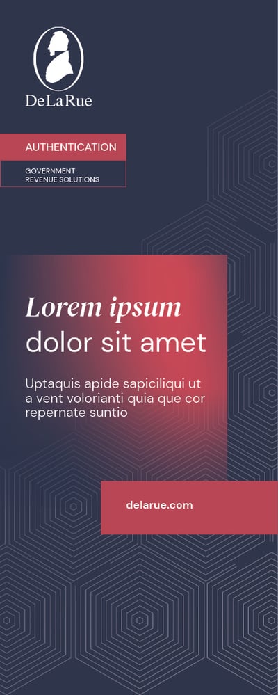
When designing a pull-up banner for the Authentication division, please consider the following:
- Use the White logo on a De La Rue Blue background
- Choose from the correct Authentication division market pattern and gradient
- A large gradient filled title block holds the headline, written in DM Sans, with key words highlighted in DM Serif Display Italic. Select from the correct Authentication division gradients to place within the title block
- Use the tier 1 or 2 division labelling system to indicate that this is an Authentication document. This should be placed below the logo and connect with other elements
- Use the underlying grid to position blocks as part of our graphic system
- The URL can appear in a coloured block
- For accessibility and legibility purposes, avoid placing text or important information below waist height, or around 0.8m from the base
- More details on the Authentication division specific colours, patterns, imagery and gradients are located elsewhere in the brand portal
