Colour Palette
Overview
Primary Palette
|
De La Rue Blue |
|
White |
|||
|
R: 47 G: 53 B:76 |
|||||
|
C: 86 M: 74 Y: 43 K: 44 |
|||||
|
Hex: 2F354C |
|||||
|
PMS: 296C |
|||||
|
RAL: 5013 |
Supporting Palette |
||||||||
| Amethyst | Dusky Blue | Duck Egg Blue | ||||||
| R: 60 G: 33 B: 60 | 25% | R: 72 G: 83 B: 118 | 25% | R: 101 G: 177 B: 172 | 25% | |||
| C:75 M: 89 Y: 42 K: 54 | C: 79 M: 65 Y: 32 K: 17 | C: 62 M: 11 Y: 36 K: 0 | ||||||
| Hex: 3C213C | 50% | Hex: 485376 | 50% | Hex: 65B1AC | 50% | |||
| PMS: 4118 C | PMS: 4143 C | PMS: 2460 C | ||||||
| RAL: 4007 | 75% | RAL: 5023 | 75% | RAL: 6034 | 75% | |||
| Emerald Green | Dusky Pink | Ochre | ||||||
| R: 0 G: 156 B: 130 | 25% | R: 183 G: 70 B: 84 | 25% | R: 232 G: 199 B: 85 | 25% | |||
| C: 80 M: 12 Y: 58 K: 1 | C: 25 M: 82 Y: 56 K: 8 | C: 7 M: 17 Y: 74 K: 6 | ||||||
| Hex: 009C82 | 50% | Hex: B74654 | 50% | Hex: E7C654 | 50% | |||
| PMS: 339 C | PMS: 7419 C | PMS: 4017 C | ||||||
| RAL: 6033 | 75% | RAL: 3018 | 75% | RAL: 1012 | 75% | |||
| Stone Grey | Steel Grey | |||||||
| R: 219 G: 225 B: 222 | 25% | R: 99, G: 96, B: 94 | 25% | |||||
| C: 17, M: 8, Y: 13, K: 0 | C: 56, M: 47, Y: 47, K: 37 | |||||||
| Hex: DBE1DE | 50% | Hex: 63605E | 50% | |||||
| PMS: 7541 C | PMS: 4279 C | |||||||
| RAL: 7047 | 75% | RAL: 7005 | 75% |
Tint Hierarchy
We can use of all our supporting colours at 75%, 50% and 25%, which should be used sparingly, for example as textbox backgrounds or within graphs and charts, and should be used as prioritised below:
|
Dusky Pink |
75% |
50% |
25% |
|
Ochre |
75% |
50% |
25% |
|
Emerald Green |
75% |
50% |
25% |
|
Amethyst |
75% |
50% |
25% |
|
Dusky Blue |
75% |
50% |
25% |
|
Steel Grey |
75% |
50% |
25% |
|
Stone Grey |
75% |
50% |
25% |
|
Duck Egg Blue |
75% |
50% |
25% |
Divisions
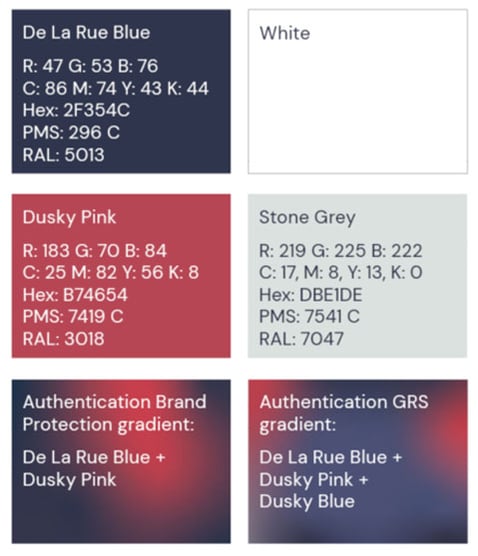
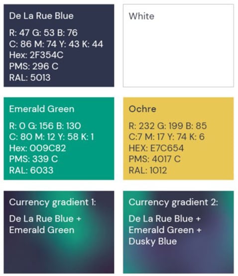
Divisional palettes and gradients
Authentication
Currency
Global gradient

Currency gradient 1

Currency gradient 2

Authentication Brand Protection gradient

Authentication ID Solutions gradient

Authentication GRS gradient

Accessibility
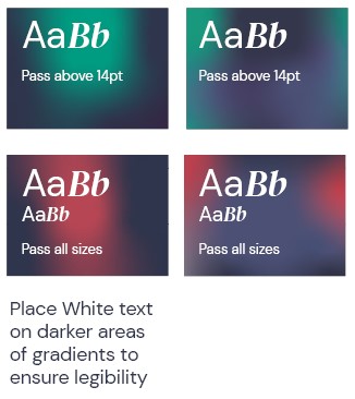
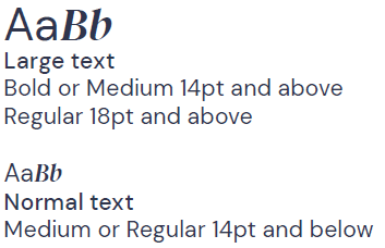
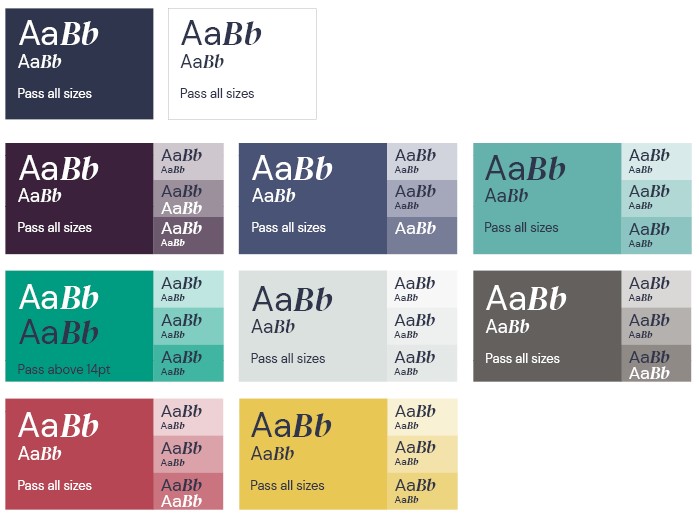
To ensure legibility of text in digital and print applications, our colour palette needs to pass online accessibility standards. Only the colour pairings shown here should be used to ensure WCAG AA accessibility is achieved on digital applications.
When using text with gradients, avoid placing White text on top of lighter colours.
Please observe the minimum text sizes shown.
Solid colours
Gradients
