Authentication
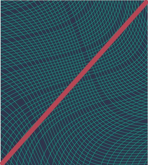
Pattern 1 - Brand protection

100% opacity
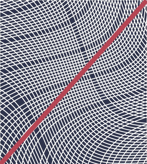
Pattern 2 - Government revenue solutions

50% opacity
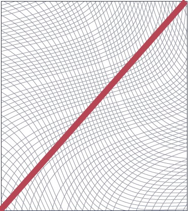
Pattern 3 - ID Security solutions

50% opacity
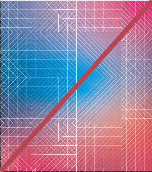
Currency
Pattern 1

50% opacity
Pattern 2

50% opacity
1. Do not change colour |
2. Do not change line weight |

3. Do not place on other colour backgrounds |
4. Do not place on white background |
5. Do not place over other gradients |
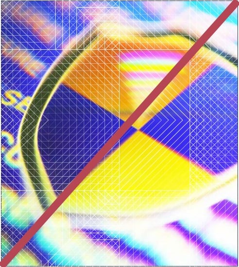
6. Do not place over imagery |
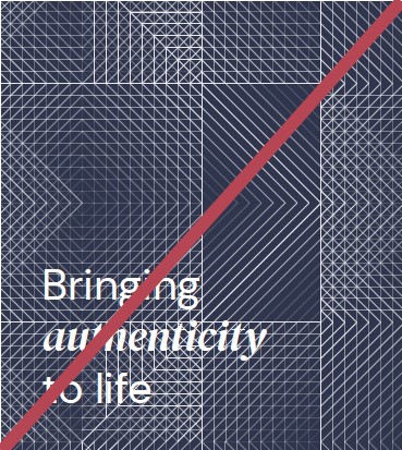
7. Do not place text directly over patterns |

8. Do not stretch or distort |