/Global_16-9.png?width=992&height=558&name=Global_16-9.png)
Widescreen landscape materials should use a base grid consisting of 12 rows and 24 columns
/Authentication_GRS_A4L.png?width=500&height=353&name=Authentication_GRS_A4L.png)
/Currency_Pattern%202_A4L.png?width=500&height=353&name=Currency_Pattern%202_A4L.png)

Any other irregular size materials can use a portion of the most appropriate base grid
Overarching global brand
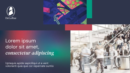
- De La Rue Blue background
- Enabling thriving society image
- Product detail image
- Global gradient block holding headline
- Supporting coloured blocks
Internal and flex
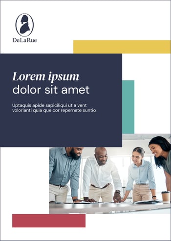
Use the same general principles as overarching global brand with a few exceptions:
- Images should be specifically selected based on the content of the piece
- Division labelling may be required
- For further examples of flex communications, visit the Flex page here
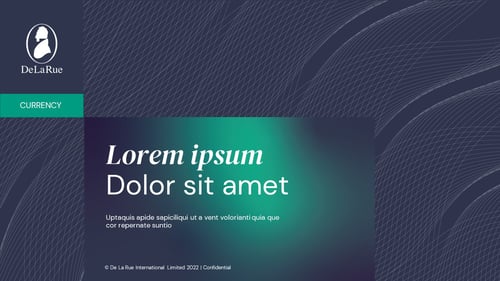
Division level

- De La Rue Blue background
- Product in society image
- Gradient coloured block
- Divisional tagging system
- De La Rue Blue background
- Graphic pattern with clear space for logo
- Gradient coloured block
- Divisional tagging system
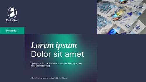
Division product level
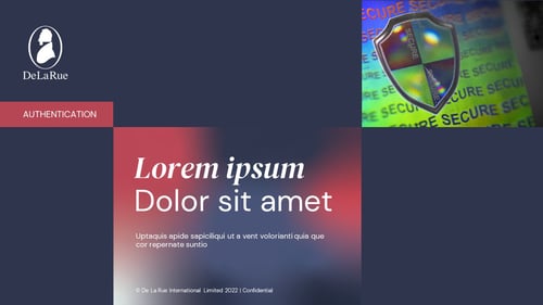
- De La Rue Blue background
- Product detail image
- Gradient coloured block
- Divisional tagging system
- De La Rue Blue background
- Product detail image
- Gradient coloured block
- Divisional tagging system
/WNTD%20Graphic%20system%201.jpg?width=500&height=287&name=WNTD%20Graphic%20system%201.jpg)
1. Do not use more than two images per composition
/WNTD%20Graphic%20system%202.jpg?width=500&height=283&name=WNTD%20Graphic%20system%202.jpg)
2. Do not use large blocks of or too many supporting colours
/WNTD%20Graphic%20system%203.jpg?width=500&height=283&name=WNTD%20Graphic%20system%203.jpg)
3. Do not use graphic patterns in combination with imagery
/WNTD%20Graphic%20system%204.jpg?width=500&height=281&name=WNTD%20Graphic%20system%204.jpg)
4. Do not use supporting colours in background