Global brand
The Global brand covers all communications that are promoting the De La Rue brand as a whole. It uses all of the brand colours, but with its specific pattern and gradient to distinguish itself from the Divisonal creative.
Whatever is being created, video, brochures, flyers - or a PowerPoint deck, we need to ensure the correct colours, patterns, gradients, typefaces and graphics are used throughout.
For external users and suppliers, please get in touch with your contact at De La Rue, or reach out to marketing@delarue.com to access our brand assets.
For all De La Rue Office365 users there is a SharePoint site which includes a document template library with pre-built PowerPoint and Word templates to get you started, an image library of approved artwork, brand assets and how-to guides to help you begin integrating the brand guidelines into your work.
Full details of the brand guidelines and links to relevant assets can be found in the menu bar.
Website
Our website homepage sits as part of our overarching global brand as it refers to De La Rue as a whole.
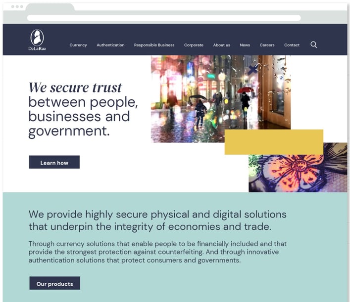
The headline and subheader tells us what you're offering, and the form header closes the deal. Over here you can explain why your offer is so great it's worth filling out a form for.
- Include plenty of white space with tints of the brand palette for textbox backgrounds
- Headline is written in DM Sans, with key words highlighted in DM Serif Display Italic.
Body copy is DM Sans. All dark copy should appear in De La Rue Blue and not black
- Images can appear in pairs. For the overarching global brand, place an ‘enabling thriving society’ image (relevant to the subject or title) alongside a ‘product detail’ image
- A coloured block can be used to connect the two images or add warmth – select a colour that complements the imagery - Use the underlying grid to position images and coloured blocks as part of our graphic system
- For more details on the overarching global brand specific colours, patterns, imagery and gradients, follow the <link>.
PowerPoint
This is for internal users. When creating slide decks to present to an external audience, you will need to download the new template. Follow the link to access the SharePoint site.
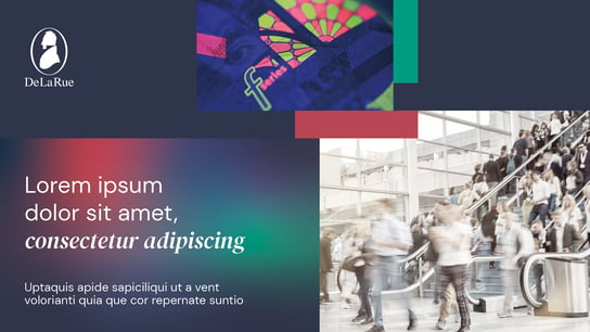
Cover and slide examples
|
|
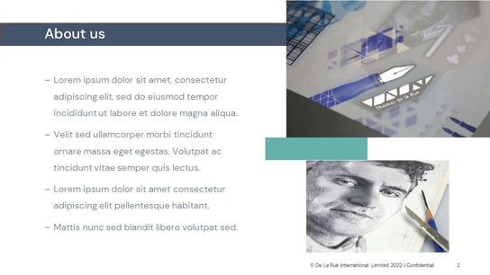
| - Use the De La Rue White logo on a De La Rue Blue background - A large gradient filled title block holds the headline, written in DM Sans or Arial, with keywords highlighted in DM Serif Display Italic or Georgia Italic. - Images can appear in pairs. For the overarching global brand, place an ‘enabling thriving society’ image (relevant to the subject or title) alongside a ‘product detail’ image |
- Page titles are held in coloured blocks for emphasis. Titles and body copy are written in DM Sans or Arial - Use the underlying grid to position images and coloured blocks as part of our graphic system. Images can bleed off the edge for maximum use of space - Include plenty of white space and consider using tints of the brand palette for highlight or textboxes |
Pull-up banner design
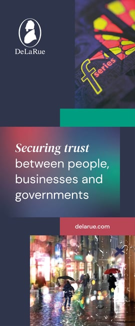
When designing a pull-up banner for the overarching global brand, please consider the following:
- Use the De La Rue White logo on a De La Rue Blue background
- A large gradient filled title block holds the headline, written in DM Sans, with key words highlighted in DM Serif Display Italic
- Images can appear in pairs. For the overarching global brand, place an ‘enabling thriving society’ image (relevant to the subject or title) alongside a ‘product detail’ image
- Coloured blocks are used to connect the elements or add warmth. Select colours that complement imagery
- Use the underlying grid to position images and coloured blocks as part of our graphic system. Images can bleed off the edge for maximum use of space and impact
- The URL is held within a coloured block
- For accessibility and legibility purposes, avoid placing text or important information below waist height, or around 0.8m from the base
- More details on the overarching global brand specific colours, patterns, imagery and gradients are in the brand portal
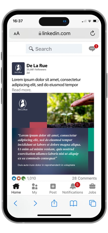
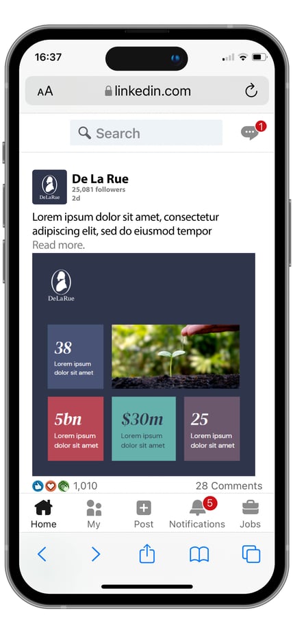
Social media posts (static)
When creating social media posts for the overarching global brand, please consider the following:
- Our logo is the Keyline White De La Rue logo on a De La Rue Blue background
- Social media posts are bold and attention grabbing, using a variety of different coloured blocks and images
- DM Sans is the primary font used, with key words highlighted in DM Serif Display Italic
- Use the underlying grid to place textboxes, images boxes and graphic elements
- The layout should be clean, not overly complicated and well balanced within the small space
- Images should be relevant to the content of the post. Aim to use a single, well-selected image
- Icons and text colour should comply with accessibility guidelines
- More details on the overarching global brand specific colours, patterns, imagery and gradients, are in the brand portal
