Our Logo
Appearance and colours
Primary logos
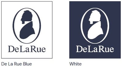
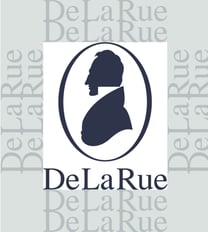
Our primary logo consists of the De La Rue silhouette symbol, held within a keyline oval, with the De La Rue wordmark stacked beneath. We have two colour versions of our primary logo – De La Rue Blue and a reversed-out White version.
Logo on colour
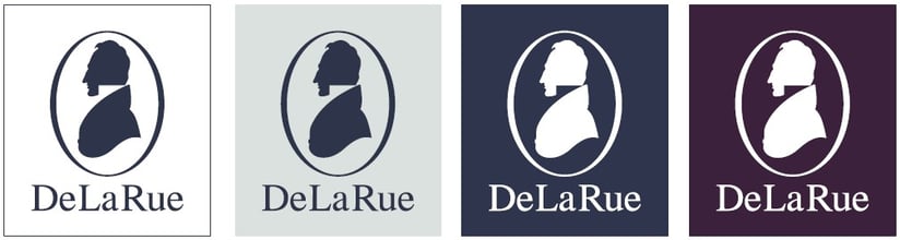
Our logos will most commonly be used on either White or De La Rue Blue backgrounds. The logo should not be placed on any other coloured backgrounds. When selecting which colour version to use, please follow the rules for accessibility found at the bottom of the colour page.
Reversed logo
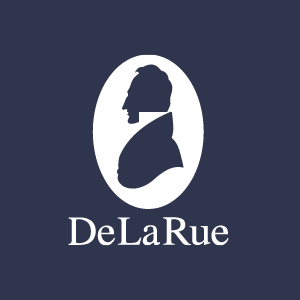
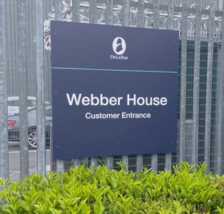
We have a simplified version of the logo, which should only be used in special circumstances, for example large-scale signage.
|
|
|
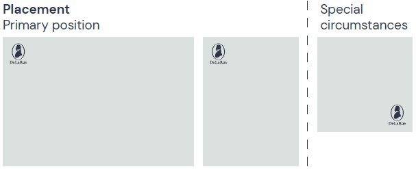
Positioning
Exclusion zone
When placing the logo make sure the exclusion zone is always followed.
The exclusion zone is two-times the height of the De La Rue wordmark, all the way around the logo.
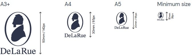
Sizing
What not to do
|
 |
 |
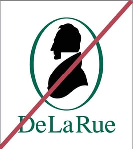 |
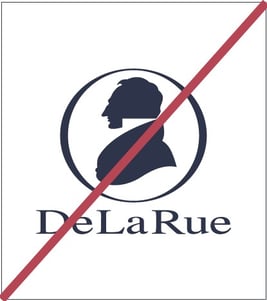
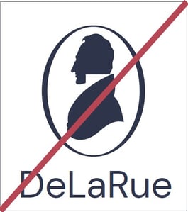
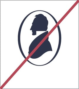
| 1. Do not squash or distort | 2. Do not use with alternative wordmark | 3. Do not use without wordmark | 4. Do not use other colourways |
|
|
|
|
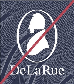
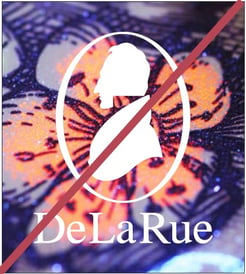
| 5. Do not place on complex patterns | 6. Do not place on complex imagery |
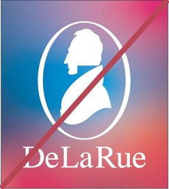
7. Do not place the logo on a gradient background. Unless designing for a mobile app icon |
8. Do not remove the keyline from the logo |
 |
|
|
|
|
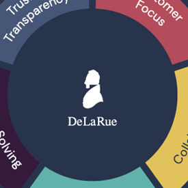
9. Do not use the logo as a design motif without approval from Marketing This also contravenes examples 1, 2, 3, 4 and 5 This is an old piece of work which is no longer used |
10. Should not use the logo as an outline stroke This also contravenes examples 3, 8 and 9 This is a past example |
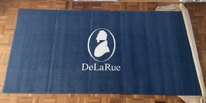
11. Our logo should never be used in a way where it can be defaced, damaged or spoiled. eg a floor mat This also contravenes example 9 and the correct usage of the reversed logo for large scale applications |
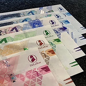
The logo should only appear in De La Rue blue, or white This contravenes example 4 - "do not use other colourways to depict the De La Rue logo" This is a past example |
Special examples
|
|